


A lot of my clients like to showcase the brands they’ve worked with—it adds credibility and highlights the breadth of their collaborations. A scrolling logo animation is a great way to feature all of these brands on screen at once.
The challenge many motion designers run into is that when you start working with a mix of individual logos, all the varying designs and fonts can easily disrupt the flow of an otherwise polished video. 👎
I’ll show you how I approach this to keep everything looking seamless and in line with the overall design. For this breakdown, I’ll be using the logo scroll I designed for the talented Andrea Serrano— go check her out! 🙌

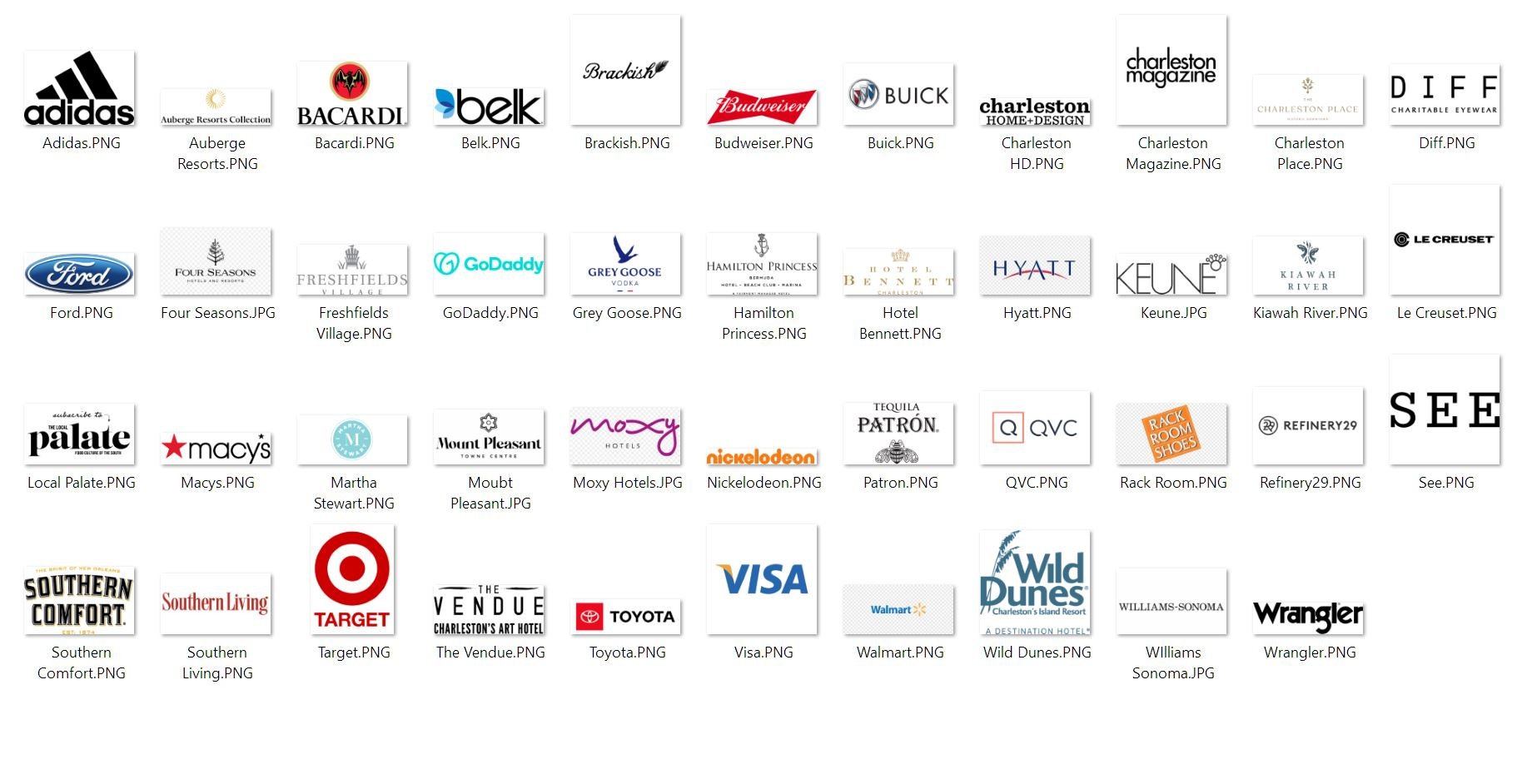
The first—and probably most time-consuming—part of this process is sourcing all the logos. I always encourage clients to send over high-quality PNGs with transparent backgrounds since many agencies already have these in their digital archives, making the process quick and easy. It’s a simple but important step that sets the foundation for a clean, professional-looking animation.
Quick Tip: For especially busy clients who haven’t had a chance to gather everything in one place, this can be a great task for an intern to tackle! 👩💻

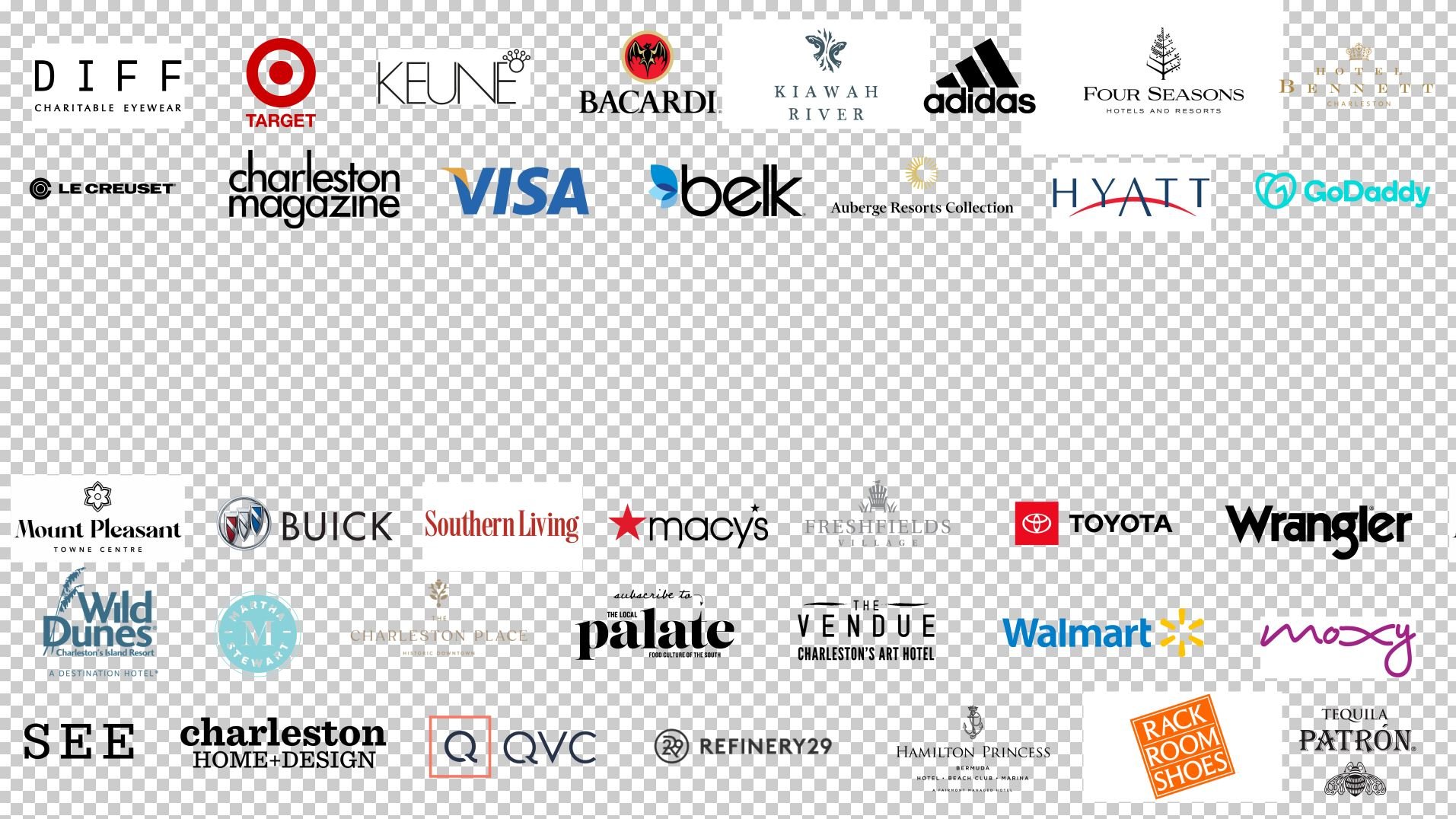
Once I have all the logos, I bring them into After Effects and start laying them out in the frame. Since I knew there would be text swiping on and off in the center, I made sure to leave enough space for it. It takes a little time to scale each logo so they all have roughly the same visual weight, but it’s worth the effort for a balanced composition.
Note: You can see below that some of the logos lack transparent backgrounds. While transparent backgrounds are ideal, it’s not the end of the world—we’ll work around the white backgrounds later in the process.
It’s a good idea to check in with the client before finalizing placement. They might have certain brands they’re especially proud to showcase, and it’s not always the ones you’d expect. A local business logo might carry more weight with their audience than a big national brand. Once you know which logos are the priority, position them closer to the center—right where viewers’ eyes naturally land. 👀
Once the layout is locked, it’s time to stylize the frame so it blends seamlessly with the rest of the video. This is the fun part! 🎉
Create a background that fits the style you’ve established in the rest of your video. In our example, Andrea’s branding uses two specific shades of purple, so I built a gradient using those colors to add a bit of depth.

Next, select all the logos at once and apply the Tint effect. Adding Tint individually—rather than pre-comping first—gives you more control over the visual weight of each logo.
Now, change each logo’s blending mode from “Normal” to “Multiply”. If you weren’t able to get all of the logo PNGs to have transparent backgrounds, this blending mode will drop out any white backgrounds and let the logos sit cleanly on top of your stylized background.
If a particular logo feels too faint, tweak its Tint effect by adjusting the “Map White To” setting toward a darker shade.
On the flip side, if a logo feels too dark against the background, reverse that process—adjust “Map Black To” and shift it toward a lighter shade. ⚪⚫

Once you're happy with how the logos look, select them all and pre-comp them together. Apply the Tint effect to this new pre-comp and change "Map Black To" from black to whatever color your background is— in this case, purple. Adjust the opacity to keep the logos subtle so they don’t distract from the main text that appears on screen.
A quick way to test this is to squint at your composition—do the logos compete with the foreground text? If so, keep lowering the opacity until it’s clear what the audience should focus on.


Before jumping into animation, check in with the client one last time. A quick approval now can save you from extra revisions later. Once you get that coveted thumbs-up, you’re good to go! 👍

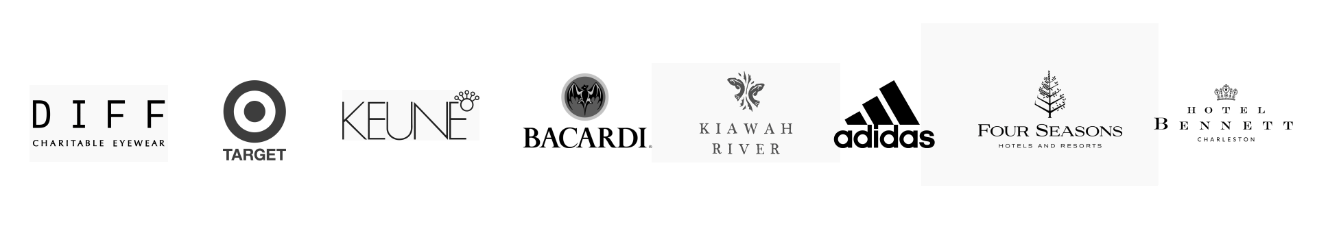
Pop open the pre-comp containing all the logos. Select all the logos in the first row of your design and pre-comp them together. Keep it simple and name the pre-comp something that’ll still make sense if you need to re-open the project file seven months from now. 😅

Double-click to open the new pre-comp. This next step is crucial for achieving a smooth scrolling look!
Since you’ll be animating the position of these logos (whether it’s left to right, right to left, up, down—whatever fits your design), the logos near the edge of the frame will eventually move offscreen, leaving behind a gap in the design.
Take a moment to think about how long this section of the video will last and what that means for how many logos will scroll off-screen. If it’s a quick brand scroll, maybe just one logo disappears from each row during the timeframe. If this animation is going to run for 20 seconds, you’ll have several logos moving offscreen, creating a much larger gap. Planning for this now will save you from headaches later! 🧠
In this example, the DIFF logo will scroll off-screen, leaving a gap on the far right of the row. To fix this, duplicate the DIFF logo and position the copy just off-screen, keeping the spacing consistent with the other logos. You’ll see a bounding box that represents the off-screen asset.

Now, when we animate the position of the logos, the frame-left DIFF logo will exit, and the frame-right one will seamlessly take its place—creating the illusion of an endless scroll.
If two logos are expected to leave the frame during this section, simply repeat the process for the second one, and so on. This small step will keep the animation feeling smooth and continuous. 👌
Repeat the process for each row or column, deciding whether you want all the logos to scroll in the same direction or alternate every other row for a more dynamic look. Let that choice guide your keyframing.
One last tip—if you typically use Motion Blur in your animations, consider leaving it off for the logos so they stay crisp and readable. Try it both ways and see what works best! 🥳
