

Brian Stansfield over at Stansfield Studios asked me to design and animate a couple of segment transitions for a live recording of The Smylie Show, a golf podcast hosted by PGA Tour winner/on-course reporter Smylie Kaufman and producer/co-host Charlie Hulme. This particular segment was going to be called Notes From Smylie’s Yardage Book.
A yardage book is a small booklet containing detailed diagrams of each hole, including distance measurements between key landmarks. It’s packed full of information that helps players make strategic decisions on club selection, shot placement, and potential hazards to avoid. This tool would be the foundation for the transition’s design—something that felt authentic to the sport while still fitting seamlessly into the show’s branding. ⛳

With that in mind, I combed through the provided photo assets from an earlier shoot at the world-famous Pebble Beach course in California. I landed on two stills that perfectly suited the segment’s theme.
I knew I wanted to keep things moving, so I animated a simple track matte to transition between the two shots. To further integrate the images with the overall design, I applied a B&W tint—this would help them blend seamlessly with the additional layers and elements I planned to introduce in the next steps. 👍


Next, I looked up some golf scorecards to get a feel for their layout and design. Using these references, I created my own mock scorecard, complete with imaginary values to maintain authenticity while keeping the design flexible for animation. This served as a key visual element, reinforcing the segment’s theme and adding a layer of realism to the overall composition. 🎨


I pre-comped all the individual scorecard layers, gave the whole comp a slight rotation and tucked it into the right third of the frame, and dropped the opacity way down to keep it subtle (it’s at 100% here for clarity). To add some extra texture, I used an ink reveal video as a track matte— this gives a nice, smoky effect.
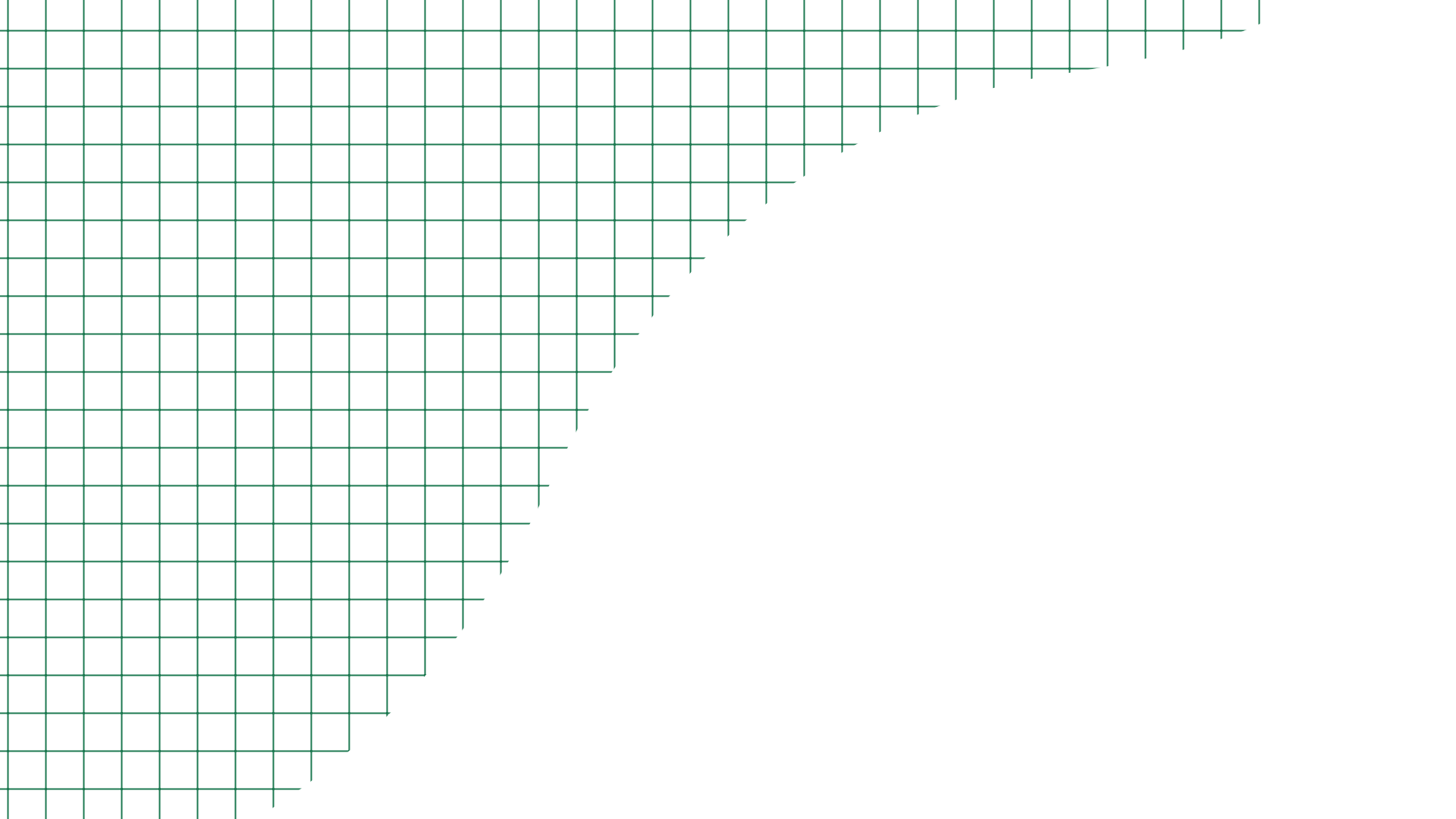
I love grids for adding small amounts of detail so I decided to add a very faint one to the top-left corner (100% opacity here for clarity) and keyframed its anchor point to create a scrolling diagonal movement. To keep things dynamic, I also drew an abstract shape layer to act as a track matte for the grid. ⬜
Next up was the course diagram element. I pulled inspiration from several examples online and sketched out a design that felt like something you’d find in a real yardage book. To give it that authentic, hand-drawn look, I applied the Roughen Edges effect, which helped reinforce the analog style we were going for. From there, I used the Trim Paths effect to animate each line, tweaking the keyframes to get the timing just right. 👌

Last but not least—the title! From watching their content, I knew The Smylie Show uses a big, bold font that’s super easy to read. We decided to try something slightly different for the transition—something that still felt like The Smylie Show but had its own distinct style. After some back-and-forth we landed on a cursive font for “Notes From” and a blocky, Schoolhouse Rock-esque font for “Smylie’s Yardage Book.”
From there, I added a thin black stroke on top of the white lettering (#1). Next I employed a little design trick I picked up by shifting the stroke just slightly so it looks misaligned with the letter (#2), giving it a more organic feel. And finally, I applied the Roughen Edges effect to smudge the stroke just enough for a subtle handwritten look (#3). Perfect! 🙌


The final step is where everything comes together—putting the motion in motion design. The main trick here was using hold keyframes on each word in the title’s scale property, giving it a jerky, stop-motion feel. This added a nice contrast to the smooth background elements and helped draw the viewer’s eye to the most important part of the frame.
To make the text animation pop, I used the principle of overshoot—scaling up from 50% to 110% before settling at 100% in a quick succession. It’s a small detail, but it gives the motion that extra bit of energy. Other than that, I parented the background elements to nulls and added subtle scaling to create a faux-3D parallax effect, adding just a bit of extra depth to the frame.
HUGE THANKS to Stansfield Studios and The Smylie Show for having me on this one—such a fun project to bring to life! 🏌️♂️